Selecting the perfect color scheme for your event is one of the most impactful decisions in the planning process. Color influences ambiance, enhances theme coherence, and creates memorable impressions that linger in the minds of guests. Whether you’re planning a wedding, corporate event, birthday celebration, or any special occasion, the right color scheme can set the perfect tone and bring your vision to life.
Why Color Scheme Matters in Event Design
When chosen carefully, color enhances every detail, from table settings to floral arrangements, lighting, and backdrops. It communicates mood, influences emotions, and helps create an immersive experience. For instance, bright colors like yellow and orange can evoke energy and excitement, while cool colors like blue and green create a calm, relaxing atmosphere. The right colors can even highlight the season or reflect the unique branding of a corporate event.
Understanding Color Psychology
Before exploring color options, it’s essential to understand the basics of color psychology and how different hues can influence emotions and perceptions:
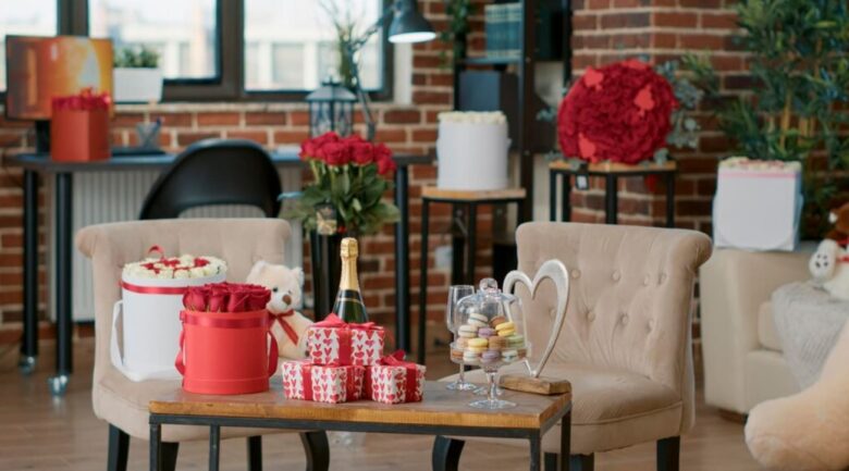
- Red: Symbolizes passion, energy, and excitement. Great for parties or high-energy events.
- Blue: Known for calmness, trust, and professionalism. Often chosen for corporate events and more formal occasions.
- Yellow: Associated with happiness, warmth, and positivity, making it a good choice for social gatherings.
- Green: Reflects harmony, nature, and balance. Perfect for outdoor or eco-themed events.
- Purple: A symbol of luxury, creativity, and sophistication, commonly used for upscale events and weddings.
- Black and White: Timeless, elegant, and versatile. A classic choice for black-tie events or minimalist themes.
Choosing a Color Scheme Based on Event Type
Different types of events benefit from different color approaches. Here are some recommendations based on the event type.
1. Weddings
For weddings, the color scheme sets the entire atmosphere. Consider the season, venue, and personal style of the couple. Popular wedding palettes include:
- Spring Weddings: Soft pastels like blush pink, lavender, and mint.
- Summer Weddings: Bright, bold hues like coral, teal, and lemon yellow.
- Fall Weddings: Rich, warm tones like burgundy, deep orange, and forest green.
- Winter Weddings: Elegant, cool shades like navy blue, silver, and emerald green.
2. Corporate Events
Corporate events often reflect the brand colors or adhere to a sophisticated, professional palette. If you’re hosting a formal conference, neutral colors like navy, gray, and white paired with accents of the brand’s color can maintain an air of professionalism. For more relaxed corporate events, consider a fresh, modern color palette that encourages creativity and engagement.
3. Birthdays and Social Gatherings
Birthday parties and social gatherings can be more playful and colorful. Choosing a theme-based color scheme—such as a tropical palette for a summer birthday or a rustic fall palette for an autumn gathering—can add an extra element of fun and coherence to the event.
How to Select the Perfect Color Palette
Step 1: Determine the Event’s Theme and Purpose
The theme is the foundation of your color scheme. A garden-themed wedding, for example, may incorporate lush greens and floral pinks, while a luxury gala may opt for classic black, gold, and white. The event’s purpose also guides color choices. A corporate launch event might focus on colors that highlight brand identity, while a family gathering could emphasize warm, inviting tones.
Step 2: Consider the Venue and Location
The venue is an important factor in color selection. Outdoor venues may naturally lend themselves to greens, blues, and earthy tones, while indoor venues allow more control over lighting and therefore color. Additionally, venues with pre-existing decor or architectural features (like a rustic barn or modern art gallery) might have colors that you’ll need to harmonize with.
Step 3: Use the 60-30-10 Rule
A classic rule in interior design and event planning is the 60-30-10 rule. This approach uses three main colors in the following proportions:
- 60% Primary Color: The dominant color, usually seen on large surfaces or significant decor elements.
- 30% Secondary Color: A complementary color that supports the primary color without overpowering it.
- 10% Accent Color: A bold or contrasting color used sparingly to create visual interest and highlight key details.
For example, for a formal event, you might choose 60% navy blue, 30% gray, and 10% gold. This formula creates a balanced, cohesive look that’s easy on the eyes.
Step 4: Leverage Seasonal Colors
Seasons can offer a natural palette, helping you align the event’s color scheme with seasonal trends:
- Spring: Pastel shades like soft pink, lilac, and baby blue.
- Summer: Vibrant hues such as coral, turquoise, and sunflower yellow.
- Autumn: Earthy tones like pumpkin, burnt sienna, and olive green.
- Winter: Cool, elegant colors like icy blue, forest green, and rich burgundy.
Seasonal colors can feel especially natural and make the event feel more in sync with the surrounding environment.
Step 5: Use Online Tools and Inspiration Boards
Online tools and inspiration boards, such as Pinterest, Adobe Color, and Coolors, can help you visualize your color scheme. By experimenting with different combinations, you can see how various colors work together and identify the hues that align best with your vision.
Tips for Creating a Cohesive Color Experience
1. Coordinate Color Across All Elements
To create a unified look, carry your color scheme across all elements, including invitations, table linens, centerpieces, lighting, and signage. This consistency helps reinforce the theme and provides a polished, professional appearance.
2. Use Lighting to Enhance Your Colors
Lighting is an essential part of enhancing color at any event. LED uplighting, for instance, can project colors onto walls or the ceiling, creating a wash of color that envelops the room. Colored spotlighting can highlight specific decor elements, while candlelight offers a softer, romantic glow that pairs beautifully with pastels and warm tones.
3. Experiment with Textures and Finishes
Incorporating textures and finishes adds depth to your color scheme. Think about using matte, glossy, metallic, or velvet textures in your linens, table settings, or drapery. For example, a matte navy blue tablecloth paired with metallic gold chargers can create an elegant contrast that draws the eye.
4. Balance Bold and Neutral Tones
A balance between bold and neutral tones helps create harmony. If you’re using a vibrant color, balance it with neutrals like beige, white, or gray to avoid overwhelming the senses. For instance, a tropical theme with bright greens and yellows can be softened with white table settings and natural wooden elements.
5. Integrate Nature-Inspired Colors for Outdoor Events
For outdoor events, nature-inspired colors—such as earthy browns, lush greens, and sky blues—can work beautifully. These tones feel organic and enhance the natural beauty of an outdoor setting, creating a harmonious environment.
Final Thoughts: Creating a Memorable Experience Through Color
Choosing the right color scheme involves more than just picking favorite hues; it requires an understanding of how color impacts mood, complements themes, and aligns with the season or event purpose. By following these guidelines, you can craft an event experience that’s visually cohesive, emotionally engaging, and memorable for every guest.
Caroline Mureithi founded Swanky Events in 2016 with a passion for creating unforgettable experiences through exquisite event planning and decoration. Based in Portland, Oregon, Swanky Events specializes in weddings, corporate events, fundraisers, and social gatherings. Caroline and her team are dedicated to turning visions into reality, ensuring every detail exceeds expectations. Visit our Facebook Page.